The room should respond: designing visitor-steered narrative
Broadcast is the default
Walk most exhibitions and you are an audience. A film plays on a loop. A panel explains. You watch, you read, you move on. It's safe, and it's forgettable, because nothing in the room knows you're there.
The brief we keep being given is the opposite: make the visitor a participant, not an audience. Let them choose the thread they care about, and have the space respond when they do.
Choice without a menu
The trap is to answer "interactive" with menus. More buttons, more sub-pages, more reading. That's not participation — it's admin.
Better is a small number of honest entry points into the same story. Pick the moment, the people, or the trade, and the room reorganises around that choice. The visitor steers; they don't navigate a database.
Designing the response
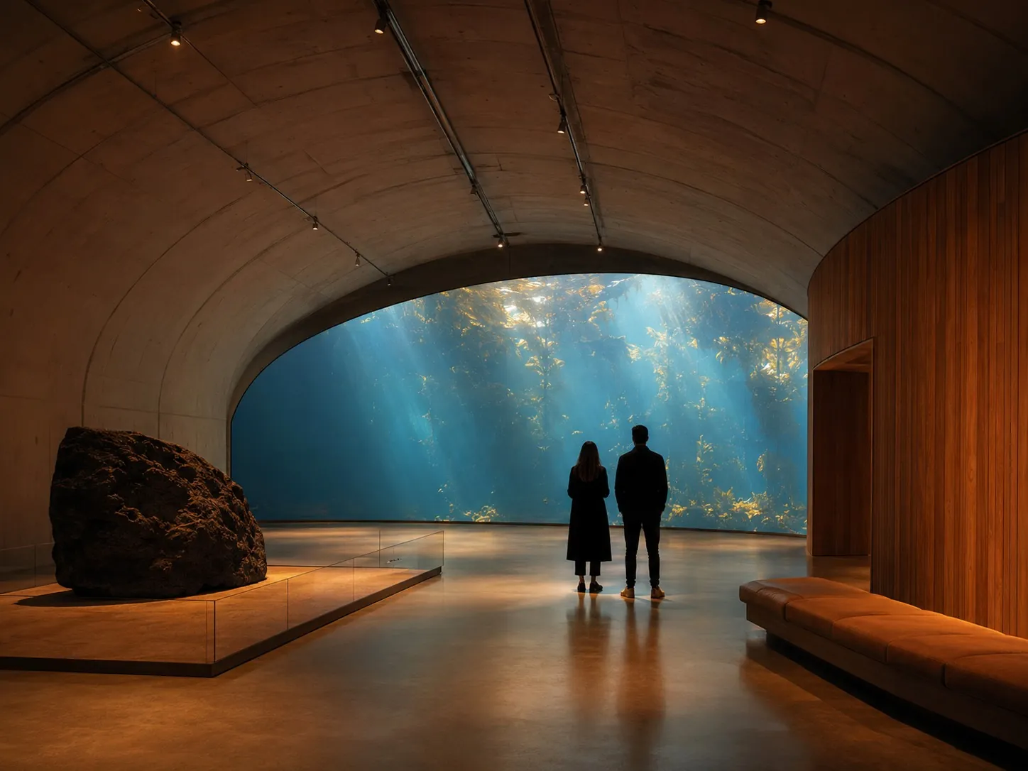
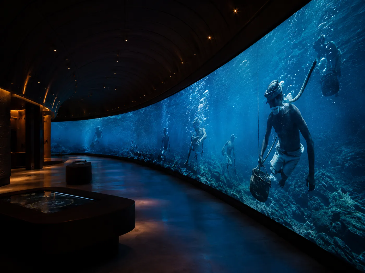
When someone makes a choice, the response has to be felt, not just shown. A wall that shifts. Audio that steers to where they're standing. A change big enough to register from across the gallery, so others are drawn in too.
That's where the build matters: the touch surface, the wall, the audio zones, and the content all have to move as one system, fast enough that the room feels alive rather than loading.
Closing
A responsive room is harder to design than a broadcast one — there are more states, more edge cases, more to synchronise. It is also the difference between a space people pass through and one they pilot.
Need help with your next project?
We've been designing interactive installations and immersive environments across the UAE since 2008. Let's talk about what you're building.
Get in touch